LifeLabs' Save my Spot app: Heuristic Evaluation and Re-design
A heuristic evaluation of Lifelabs save my spot app was conducted. In a team of 2, we improved the usability of the Save my Spot app to increase bookings through the app and decrease crowding and wait times for patients.
Project Overview
We were to imagine ourselves as part of a UX Design team at a hypothetical company, Emerge Technologies. We were tasked with evaluating the usability of an existing digital product by conducting a heuristic evaluation.
TIMELINE
2 weeks
PROJECT TYPE
Academic - Team of 2
ROLE
UX & UI Designer
DESIGNED FOR
iOS mobile
TOOLS
Figma/ FigJam
Design Process
To optimize the evaluation, we followed non-linear steps for thorough testing, ensuring the best product outcome.
Empathize
Identifying the problem space
Secondary research
Heuristic evaluation
Define

Listing usability issues
Ideate

Design prioritization matrix
Pen to paper
Executive summary
Prototype

Redesigned task flow
Empathize
What is LifeLabs?
LifeLabs offers a service known as "Save My Spot," enabling patients to virtually add themselves to a patient wait queue.
This service aims to minimize the time spent waiting at the lab by allowing individuals to check-in remotely before arriving at a LifeLabs location.

Why LifeLabs?
The LifeLabs Save My Spot app is a critical tool for many people, serving as a bridge between them and essential health services. It allows users to efficiently manage their lab appointments, saving them time and reducing in-person wait times. However, despite its importance, the app's current design has several usability issues that can hinder user experience and accessibility.
We started our process by intensively using the app and we also collected users feedback over the internet ...
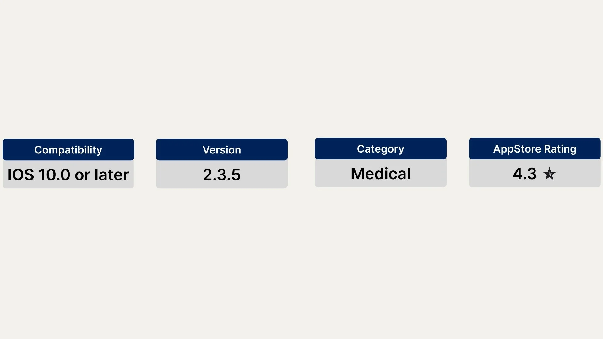
The version of the app we tested:
While the app's rating on the App Store isn't poor, largely because it functions as intended, there's definitely room to improve its usability.
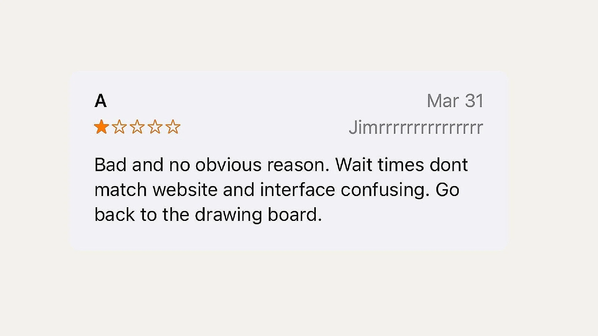
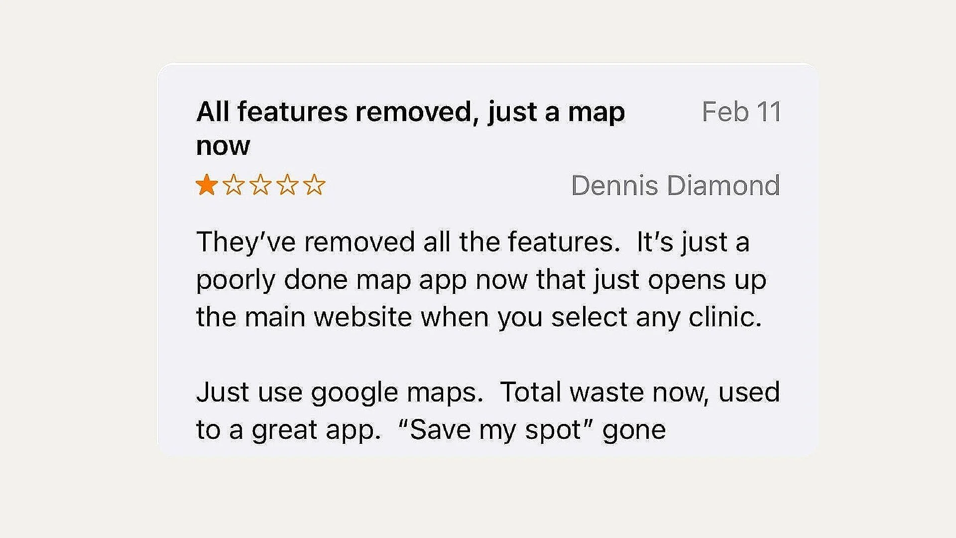
Some of the app’s online reviews
The app's post-covid ratings dropped significantly compared to the previous year.

Heuristic Evaluation
Each of us went through the website separately to evaluate it. We made note of which usability heuristics were violated and how severe the violation was. Below are the different usability heuristics and how we categorized the severity of each.
USABILITY HEURISTICS
10 principles to help guide usability for a product/design based on Nielsen and Norman group
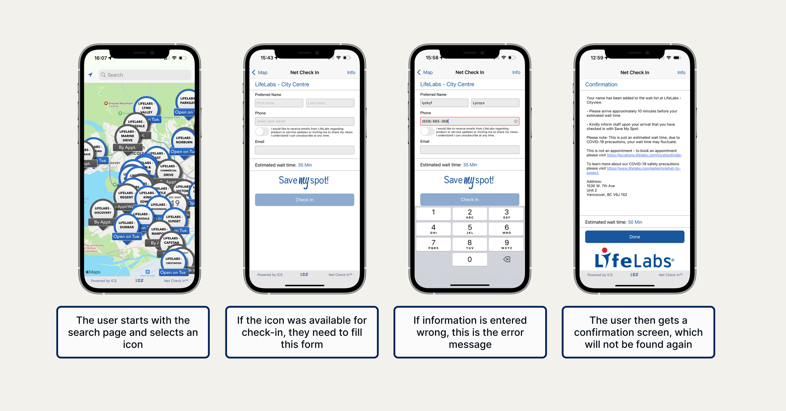
Screen shots from existing task flow
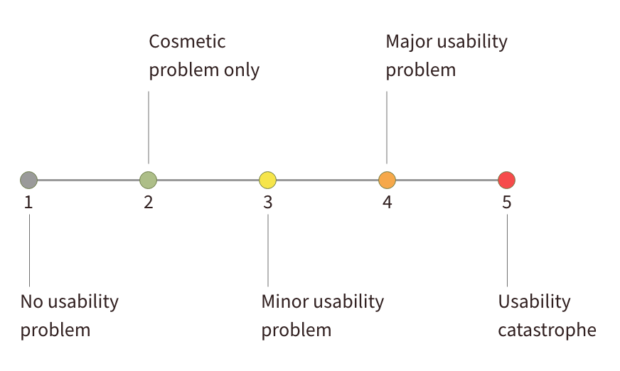
SEVERITY SCALE
Industry rating to help prioritize design decisions
Define & Ideate
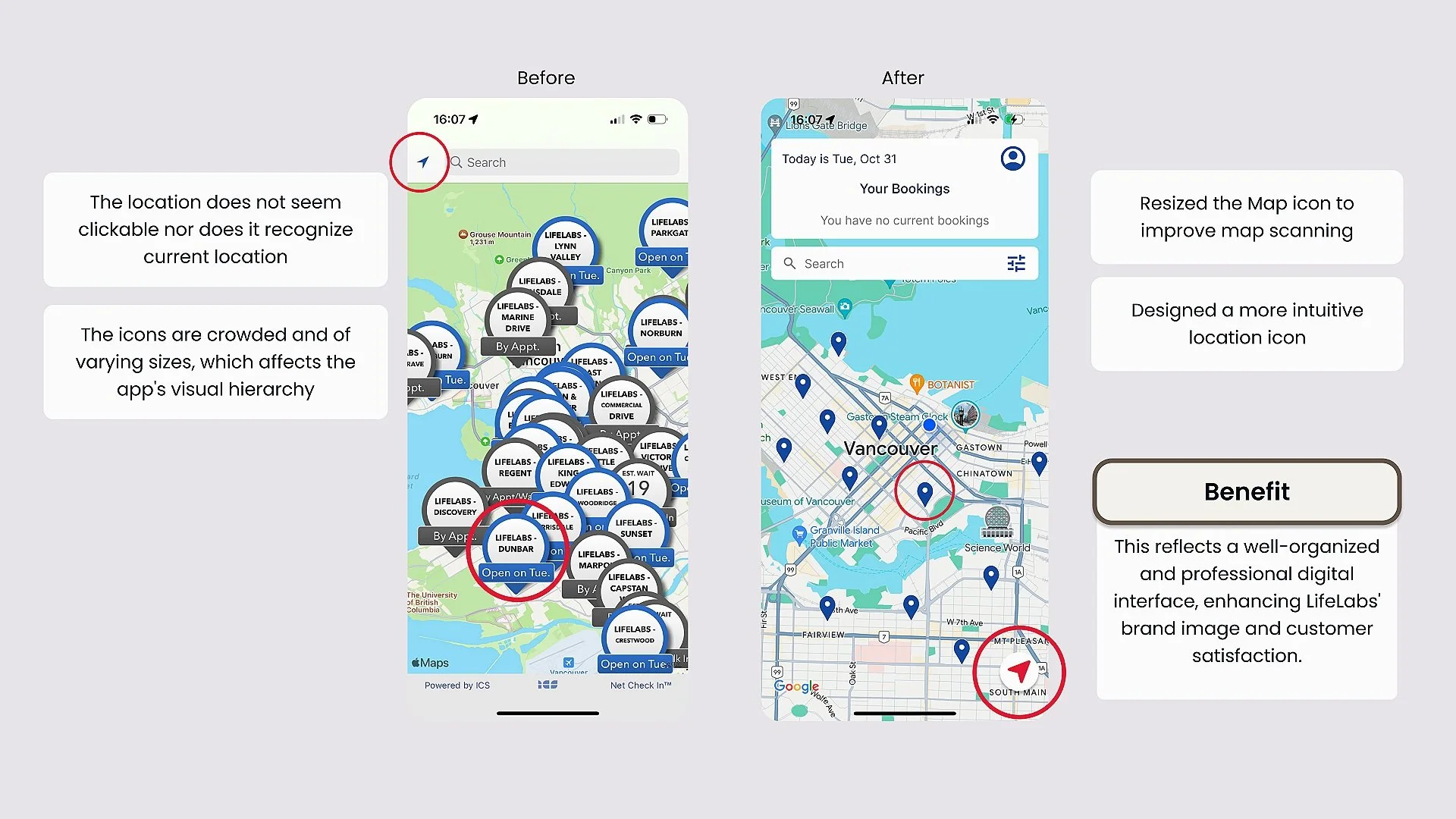
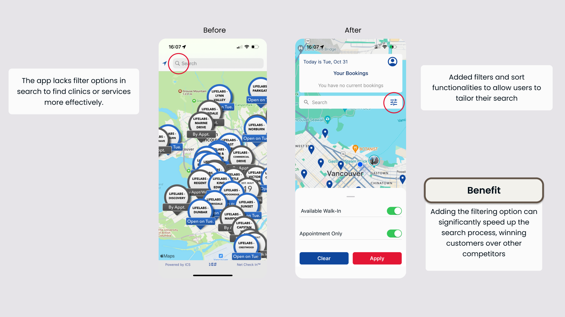
Usability issues
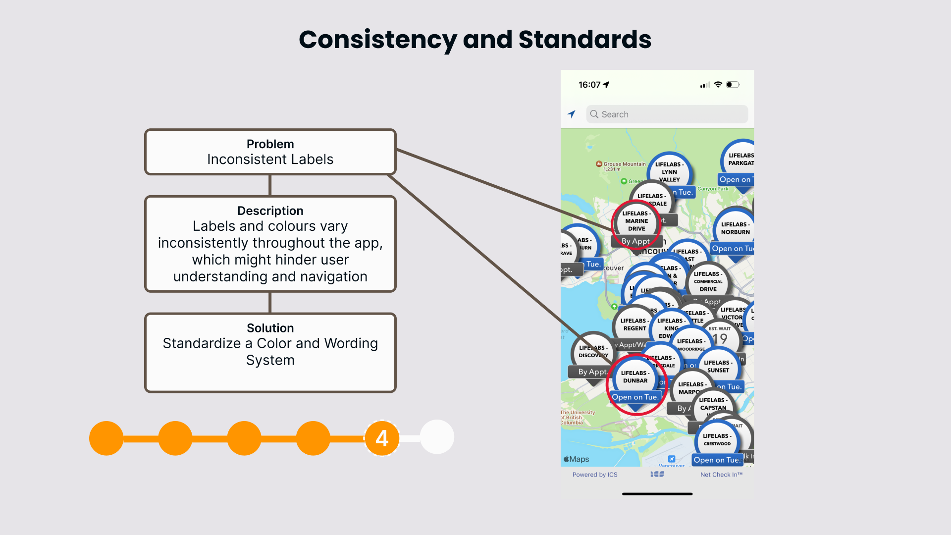
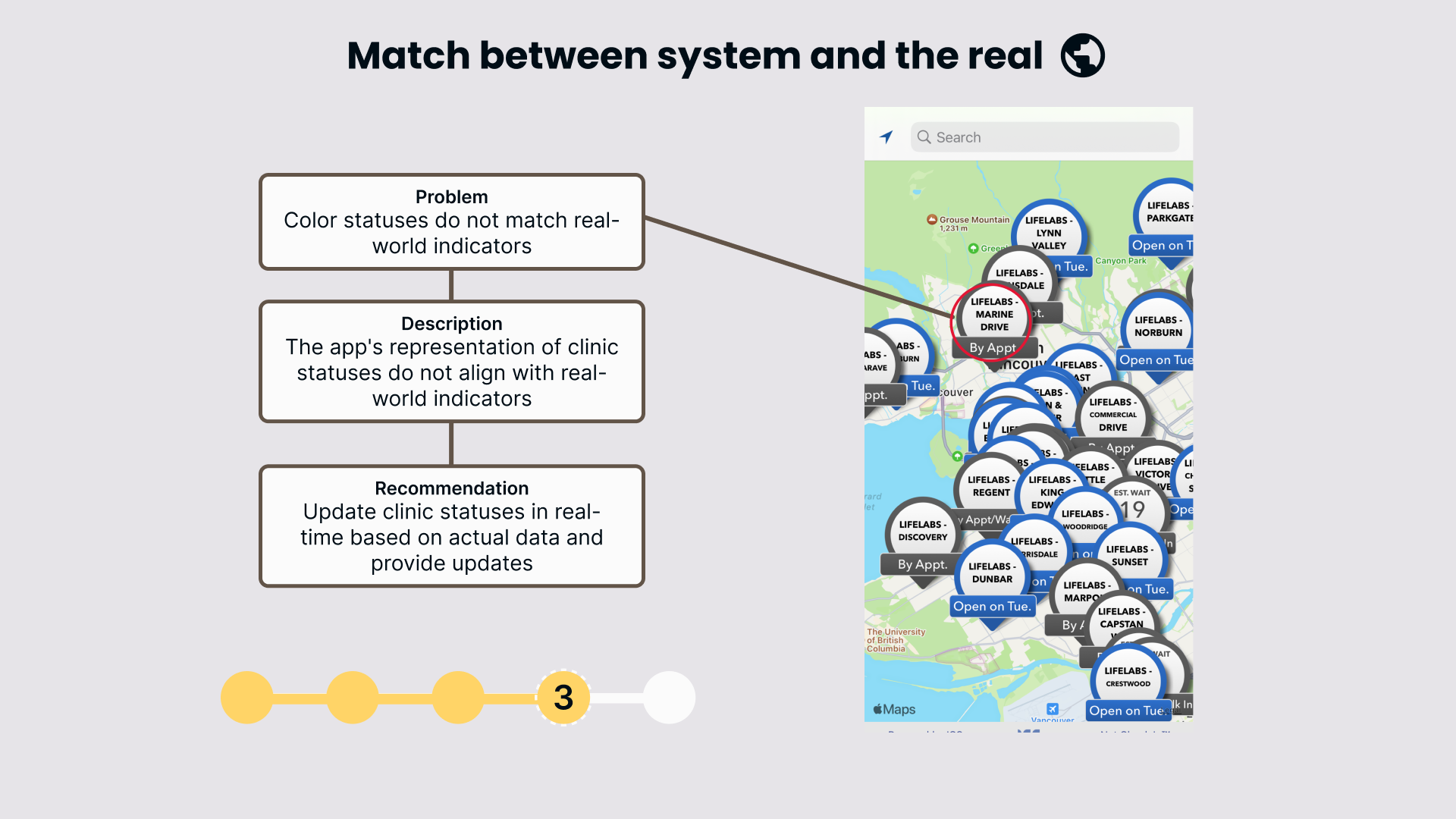
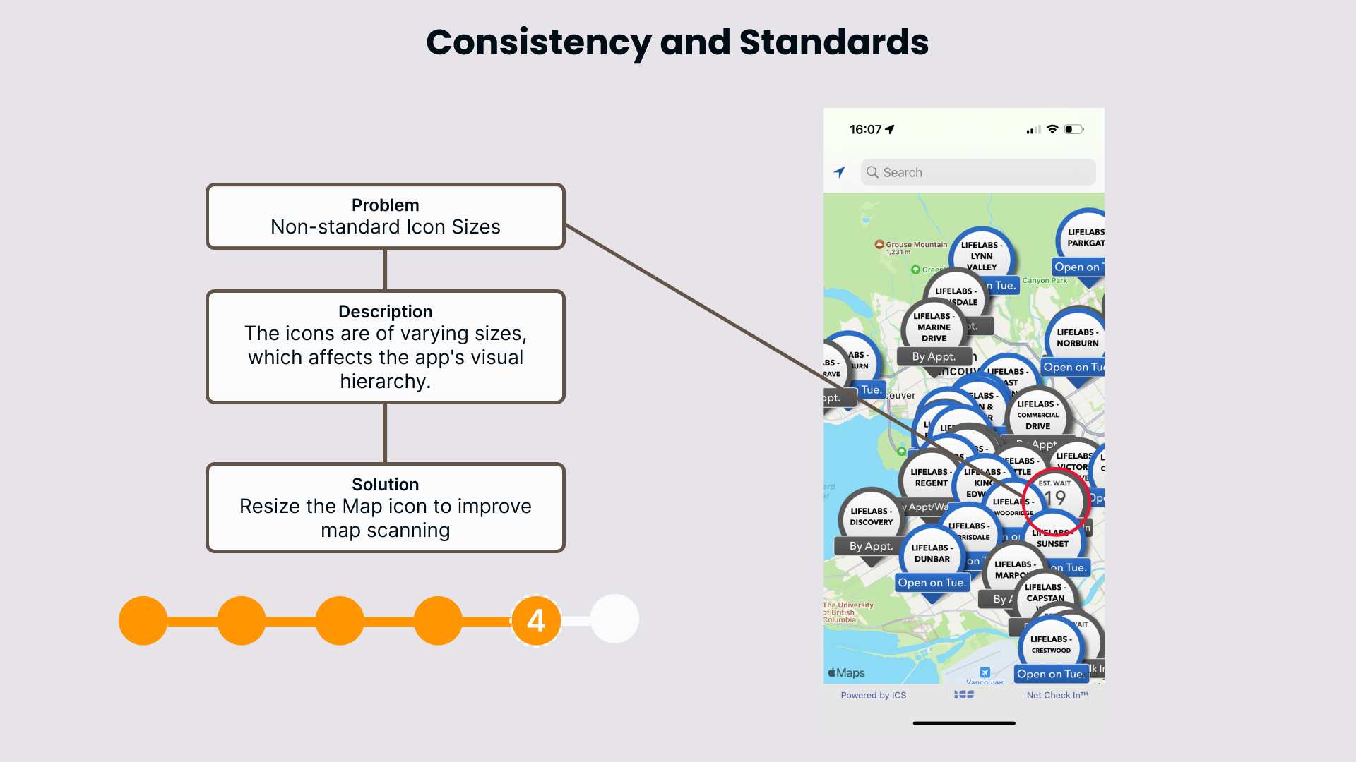
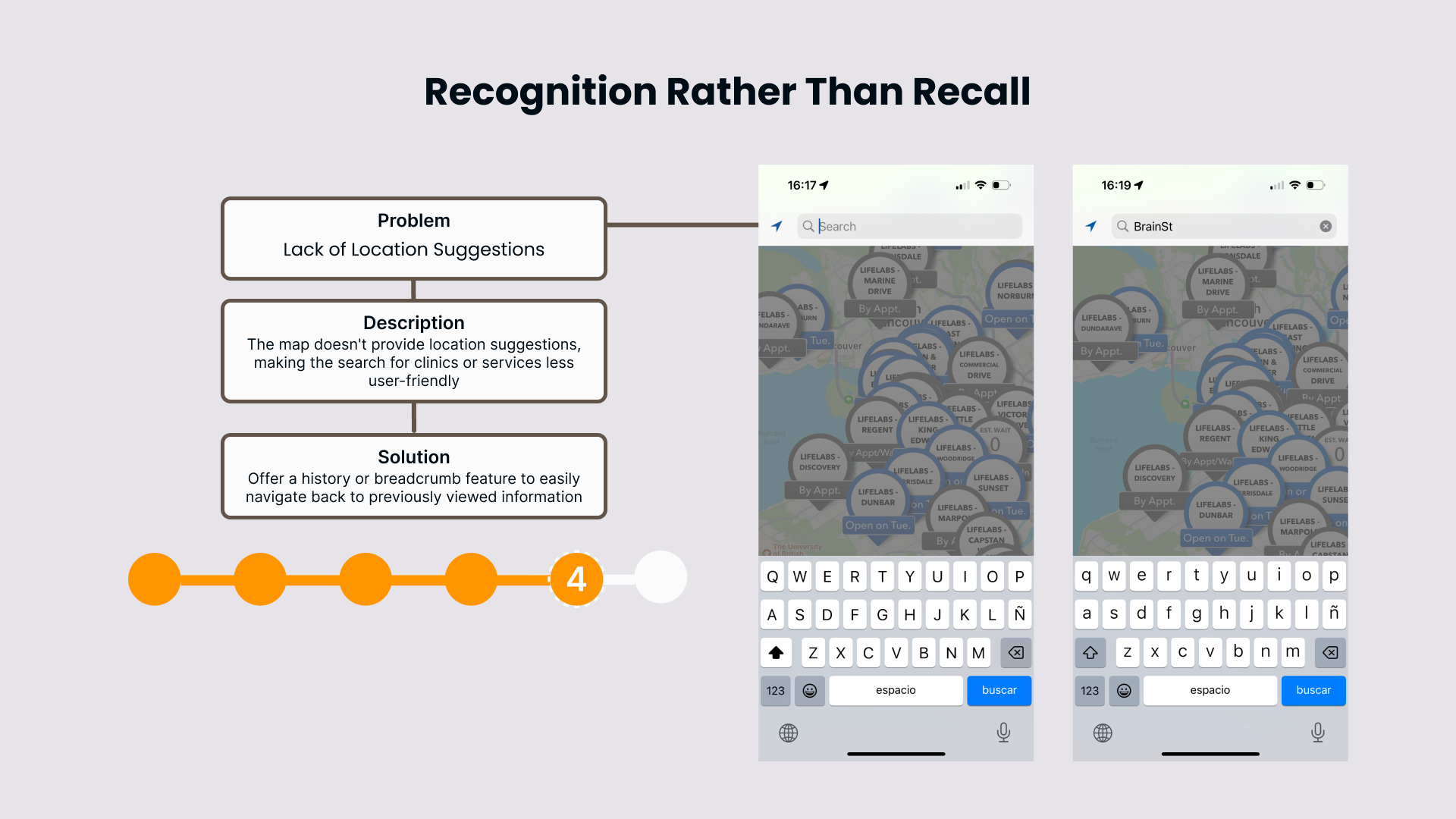
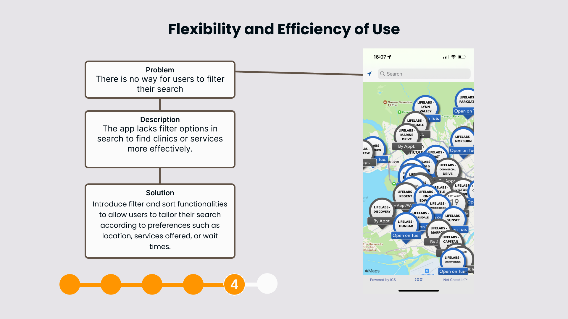
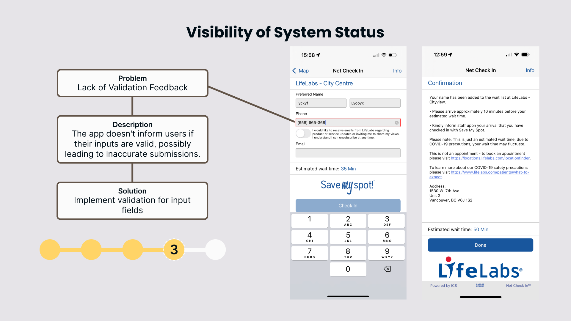
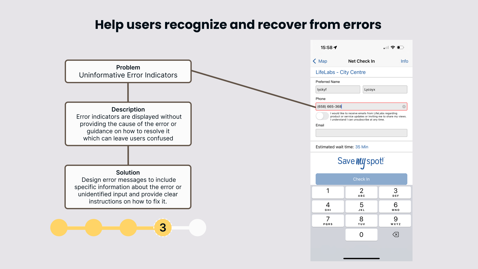
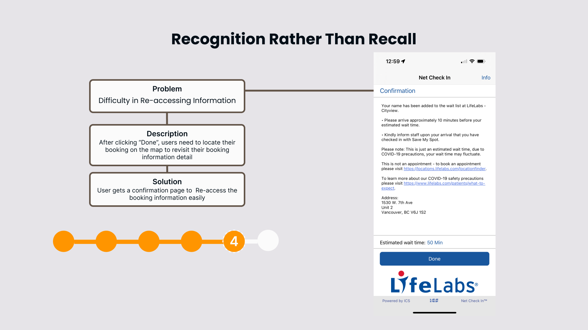
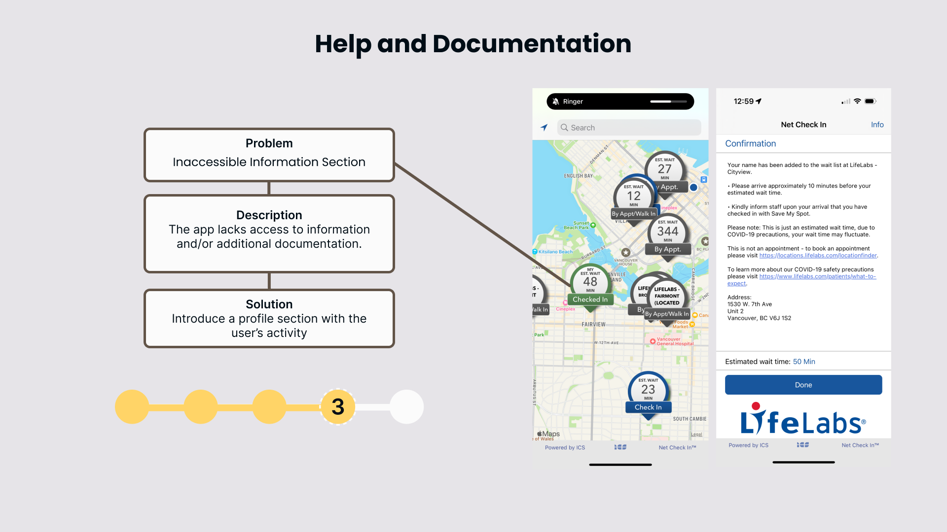
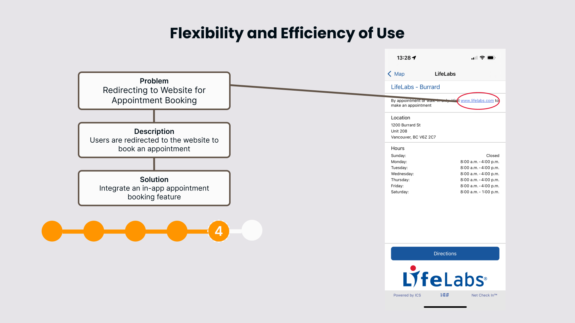
After separately creating a list of violations, we came together and decided to focus on 13 usability issues. These are listed below. They are presented in the order of severity ranking. With each issue, this information is included: The heuristic that was violated, the problem, the solution, and its severity rating.
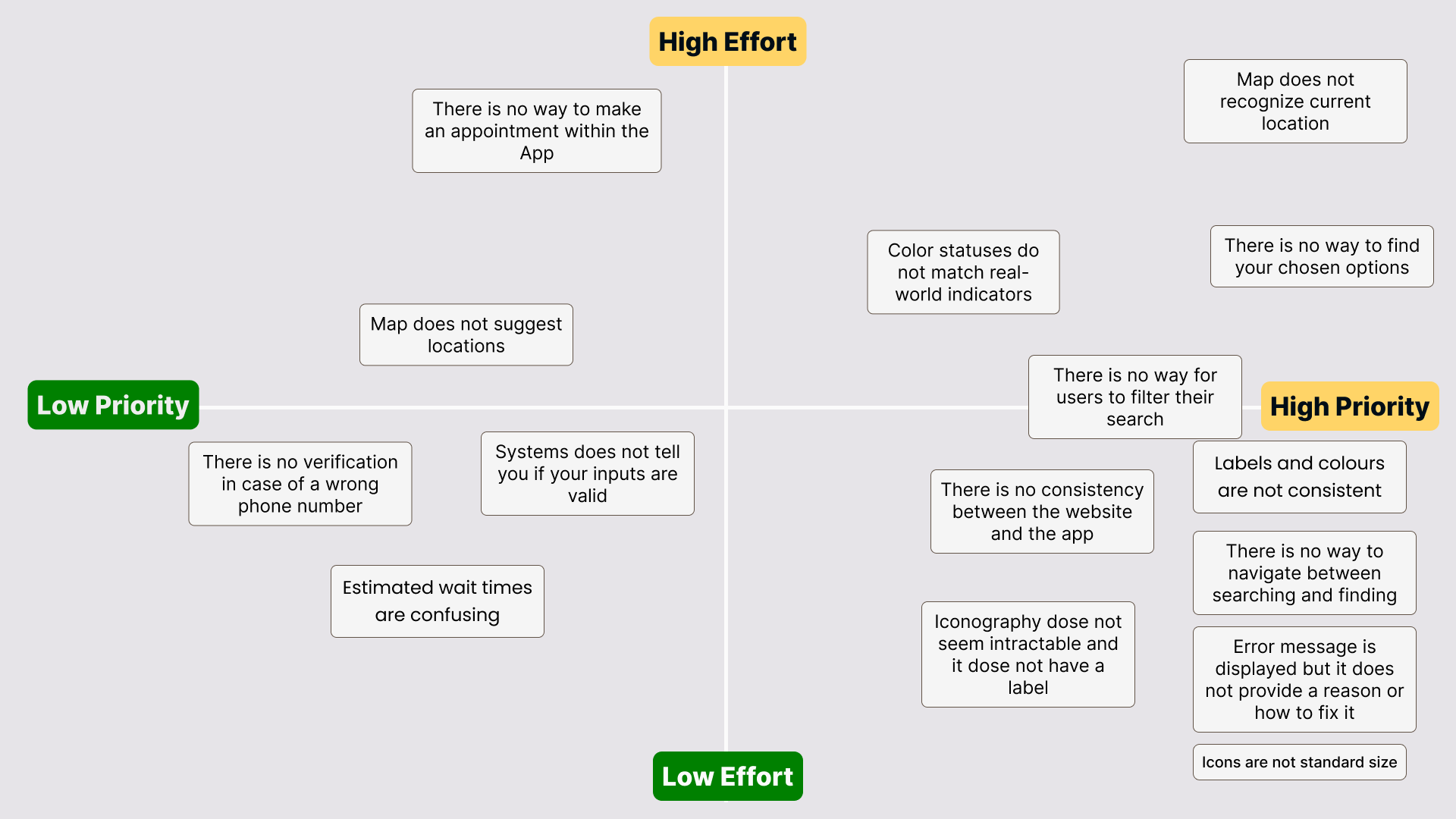
After testing and based on our findings, we collaborated and mapped these usability issues on a design prioritization matrix.
We made our redesign decisions based on the shown matrix. We focused on the designs in each quadrant in this order:
High priority, low effort
High priority, high effort
Low priority, low effort
Low priority, high effort
The redesigned screens & prototype

Before moving on to our redesigns, we wanted to ensure we kept with the LifeLabs branding as much as possible.
Throughout our redesigns, we also ensured we had the screenshots of the current LifeLabs Save my spot app screens next to what we were designing to act as a reference. We chose current colours from the website and incorporated them into our redesign.


How can we measure our redesign success?
How can we measure our redesign success?
propositional value
By updating the app’s icons for consistency and improving navigation, LifeLabs could significantly enhance the user experience and its brand image. Adding smart search filters would make finding information fast and simple. These proposed improvements aim to make the app more user-friendly and appealing as a modern healthcare provider. Implementing these changes could lead to increased user engagement and retention, positioning LifeLabs to expand its market presence and boost revenue effectively. This project demonstrates how thoughtful design enhancements could bring substantial benefits to both users and the business.